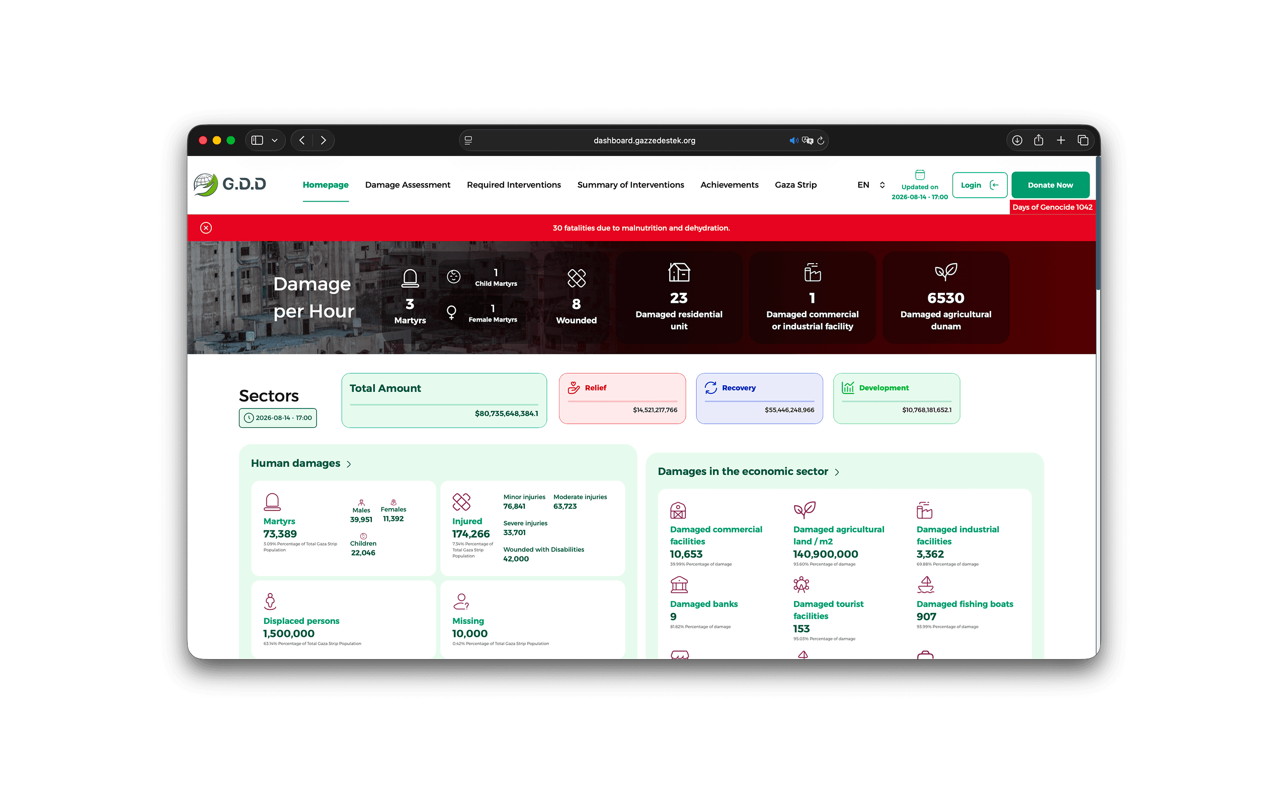
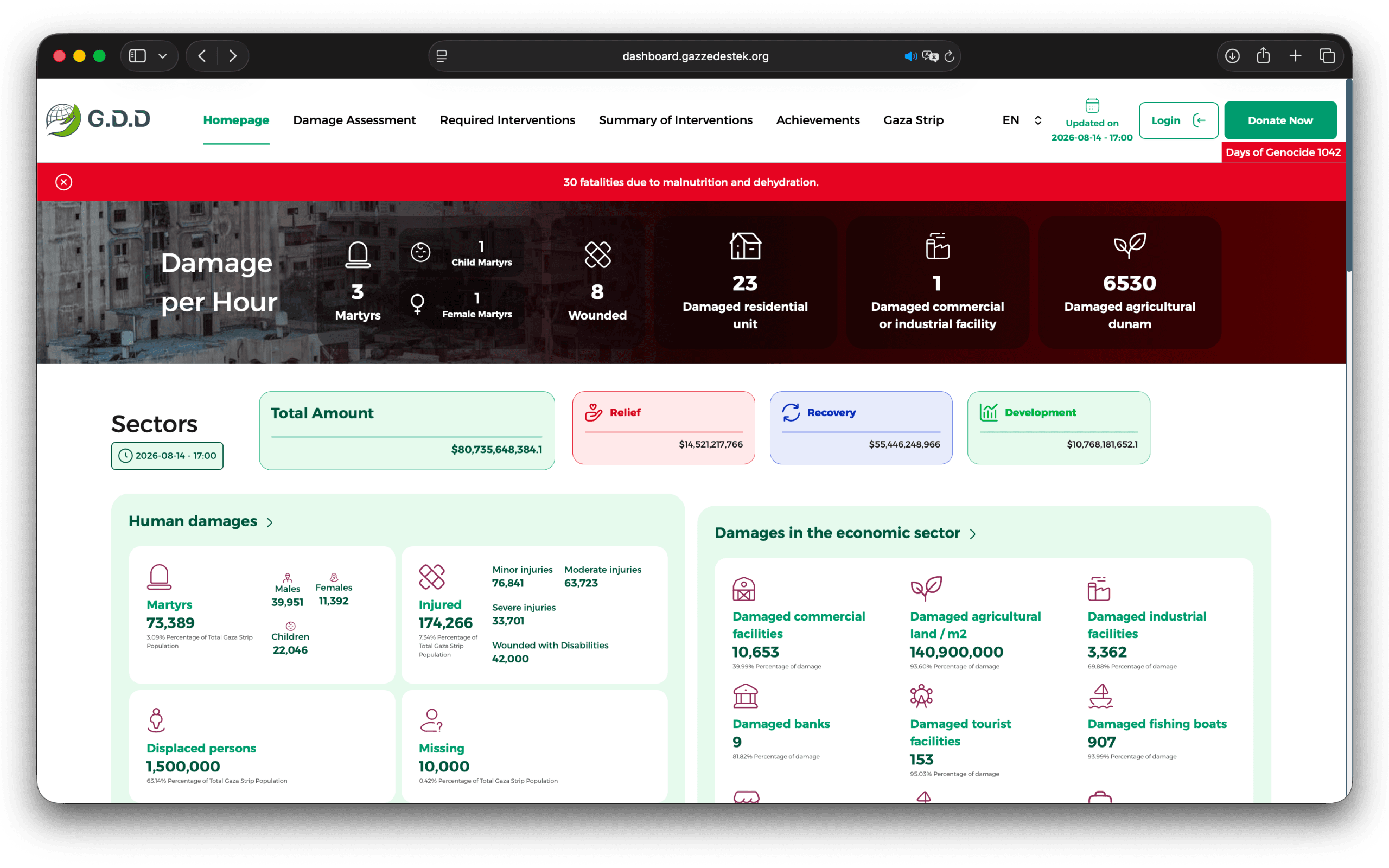
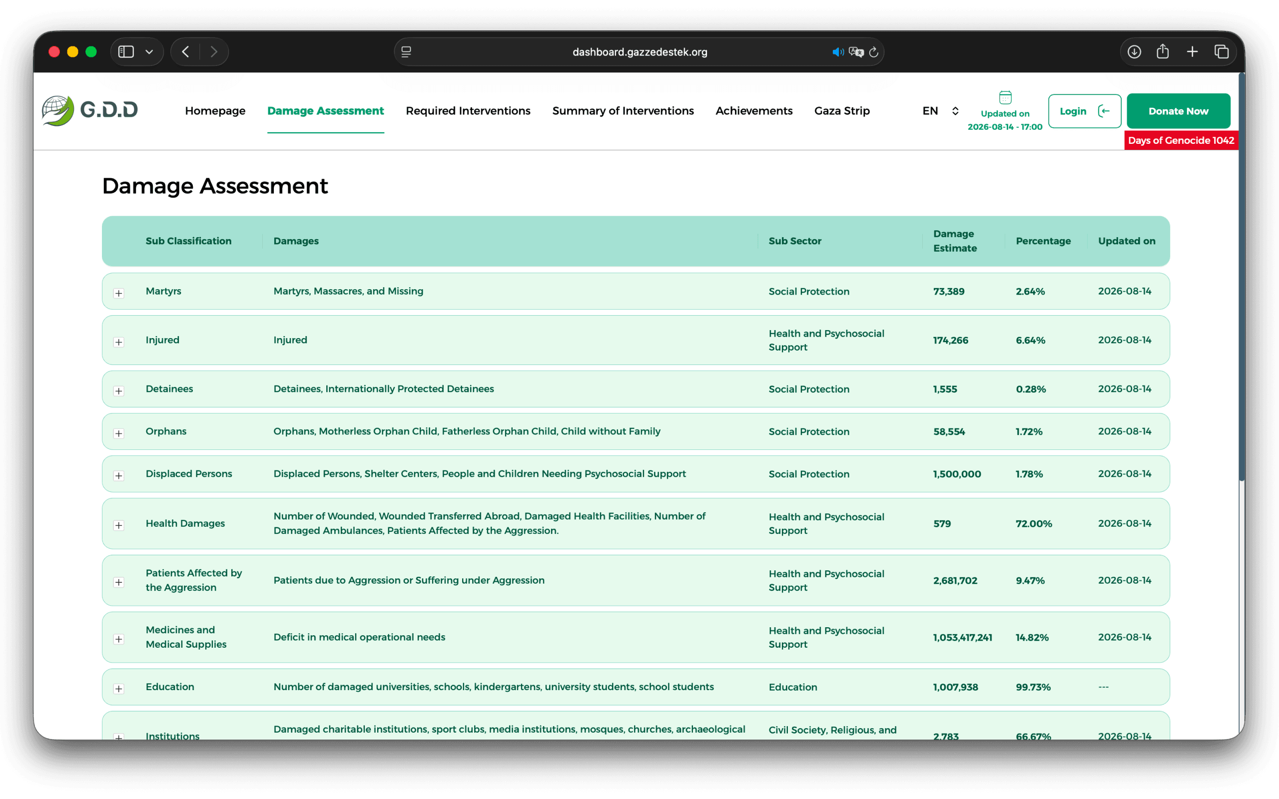
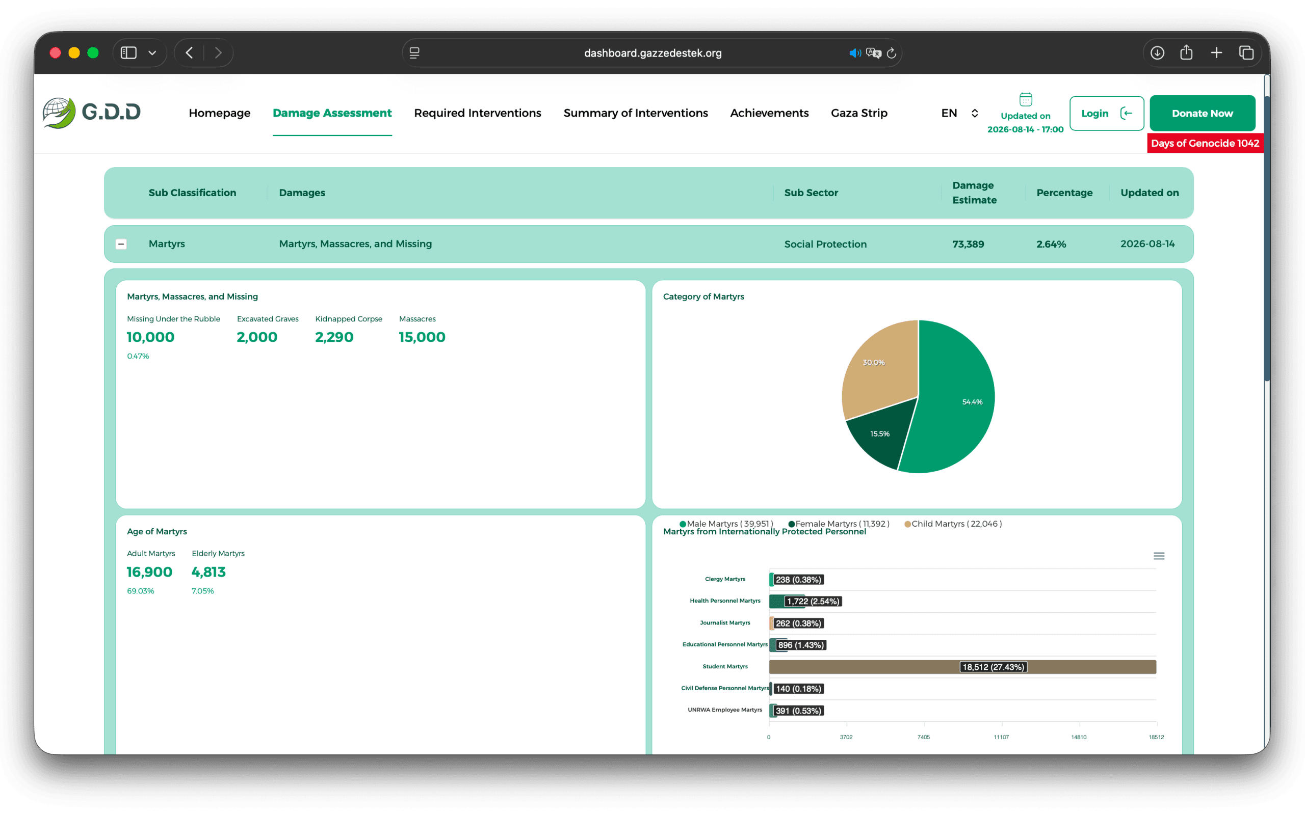
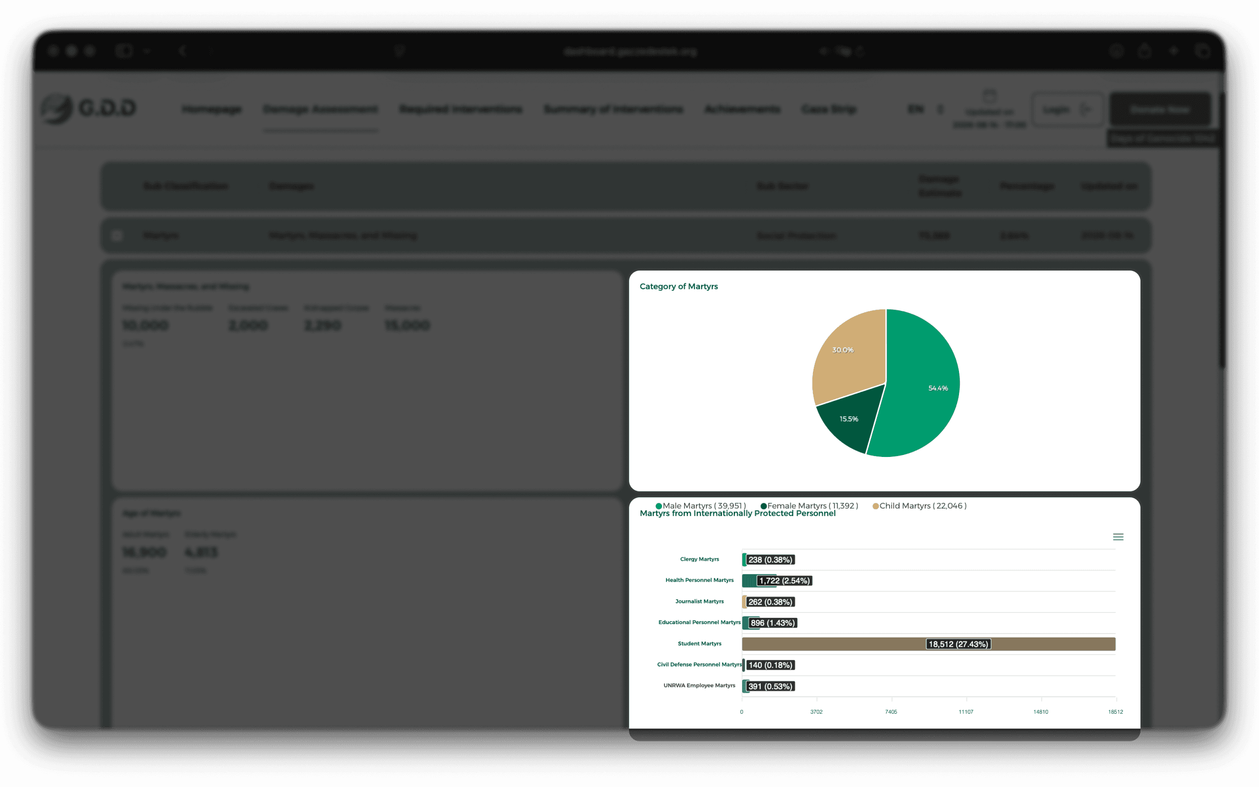
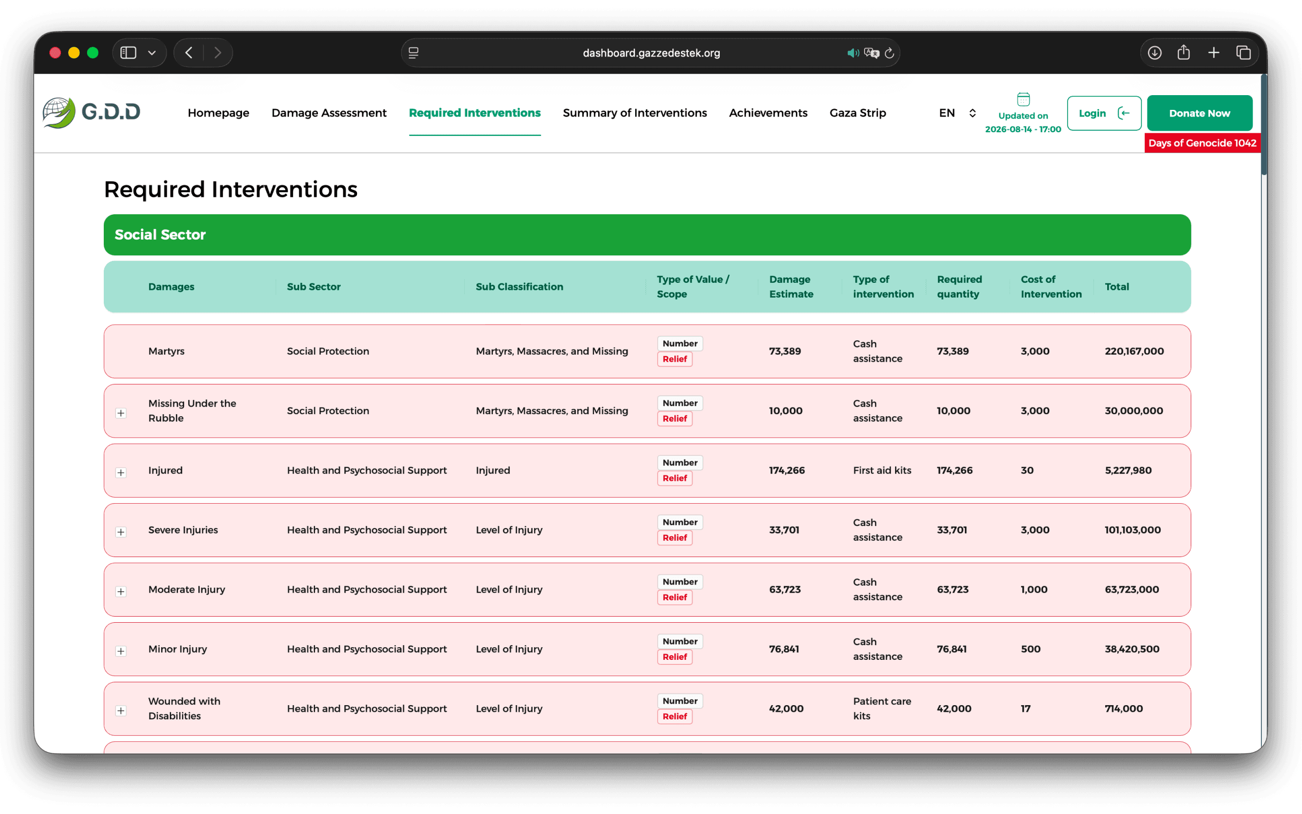
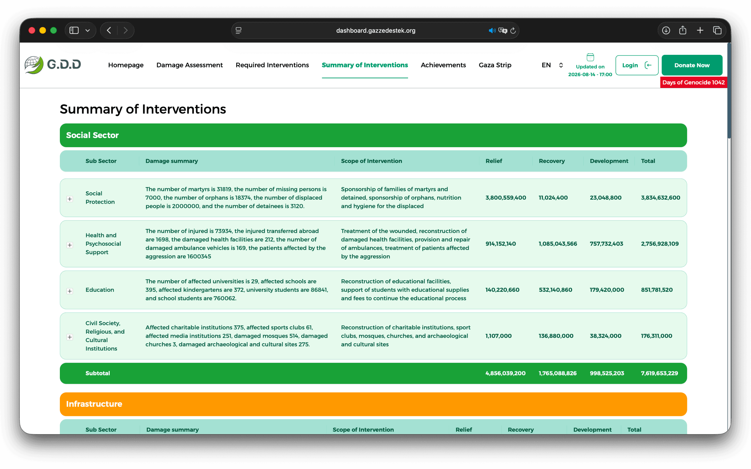
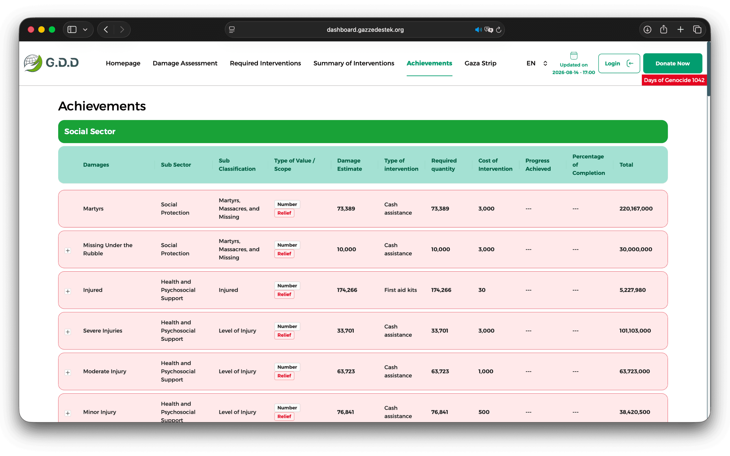
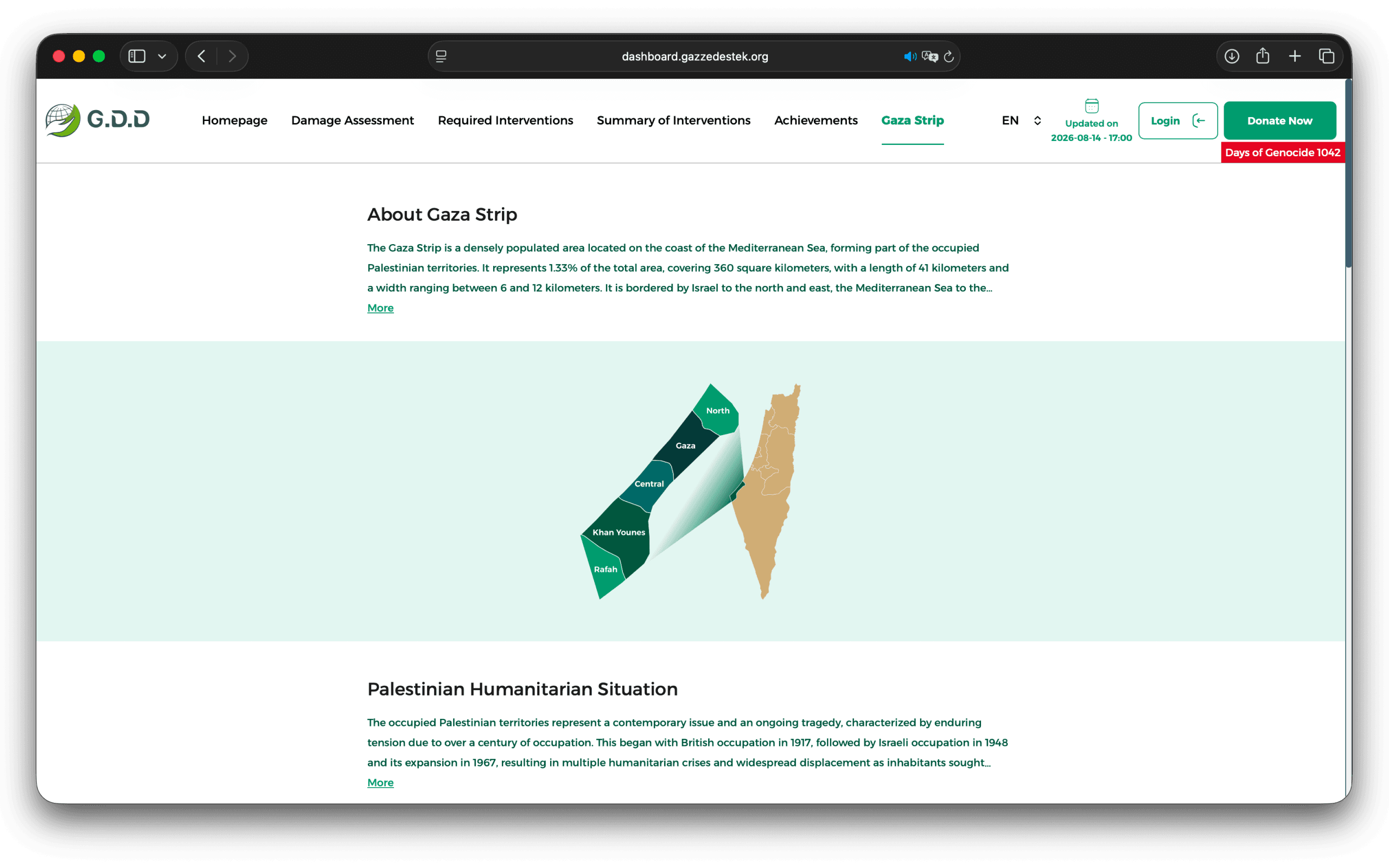
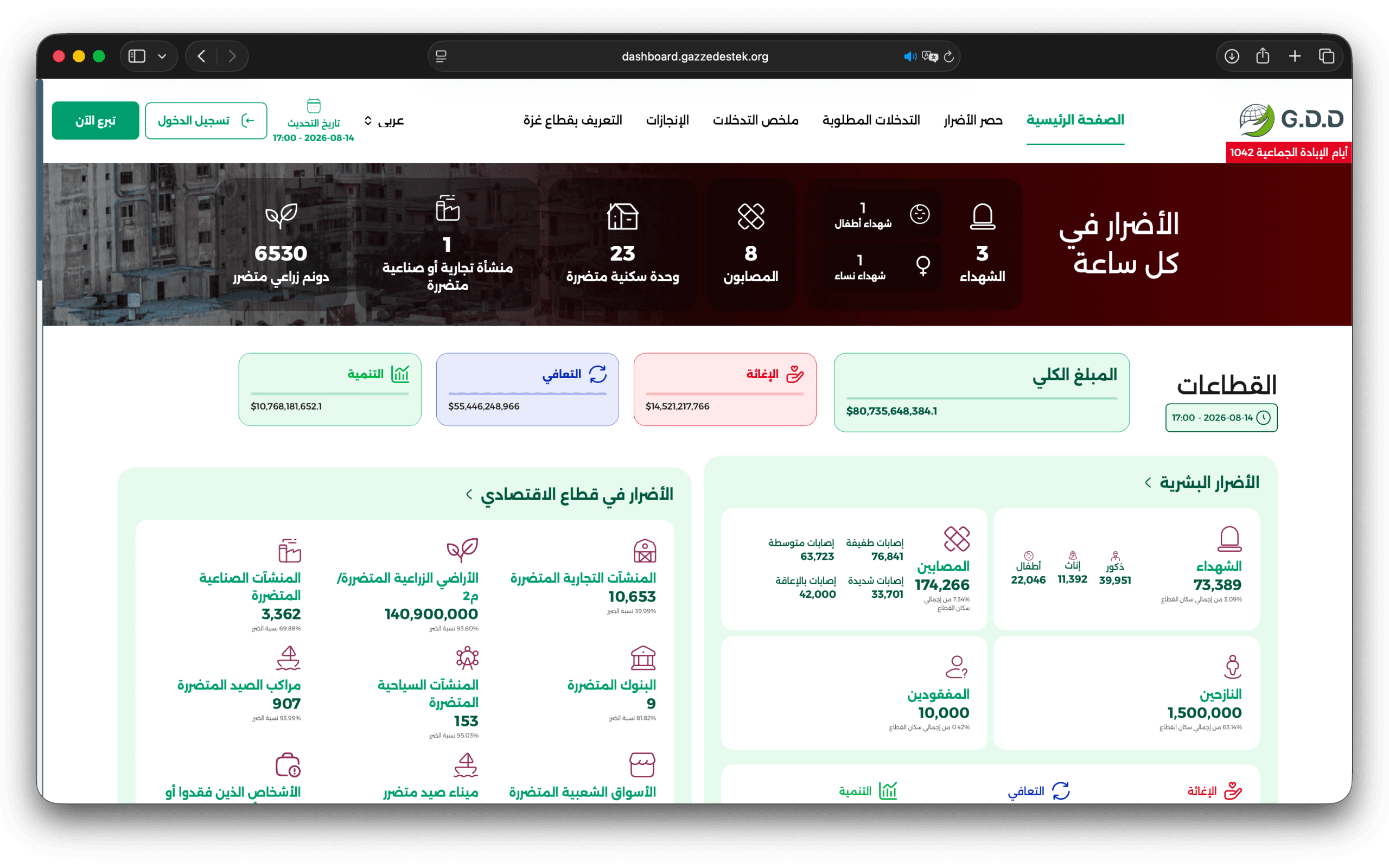
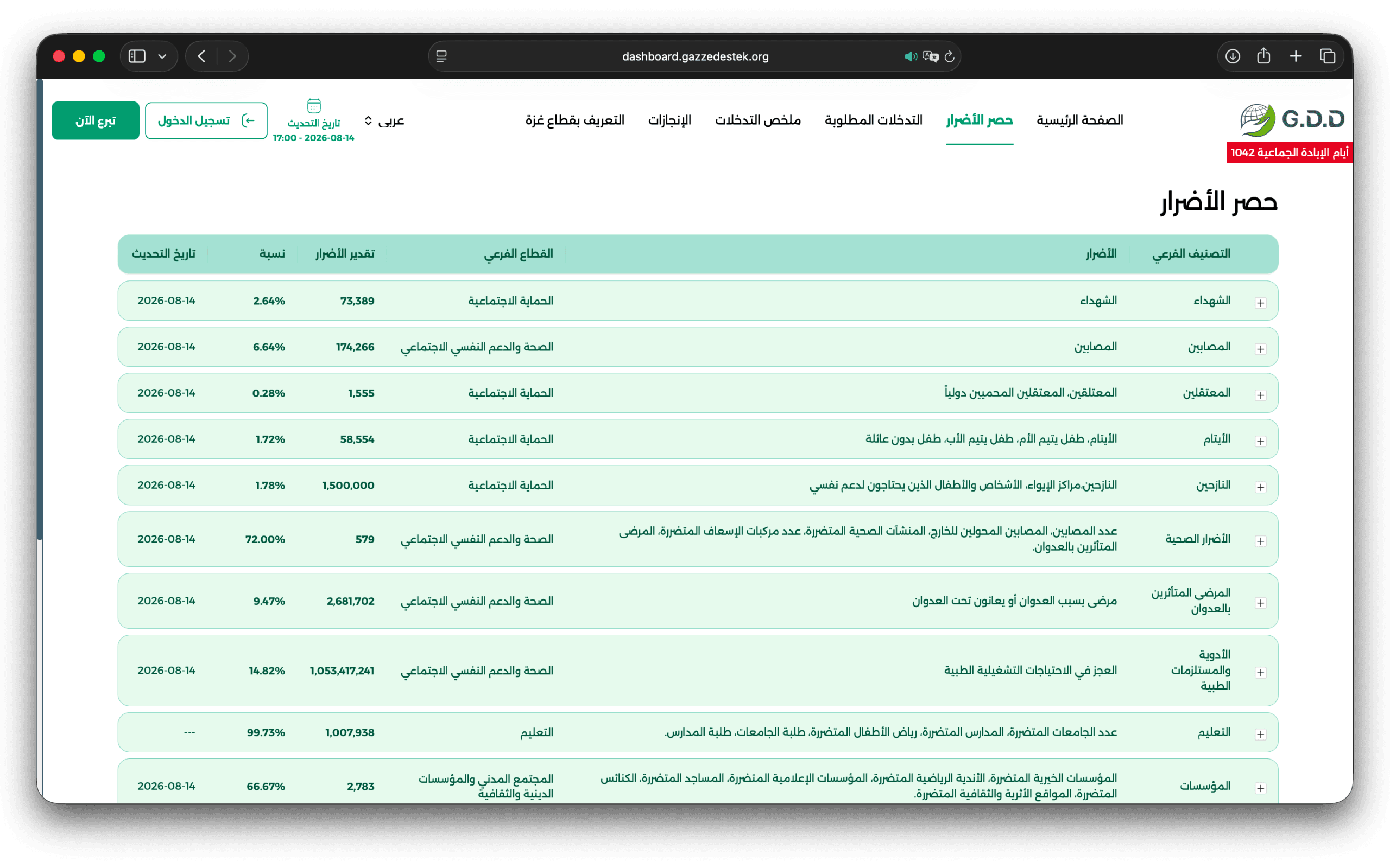
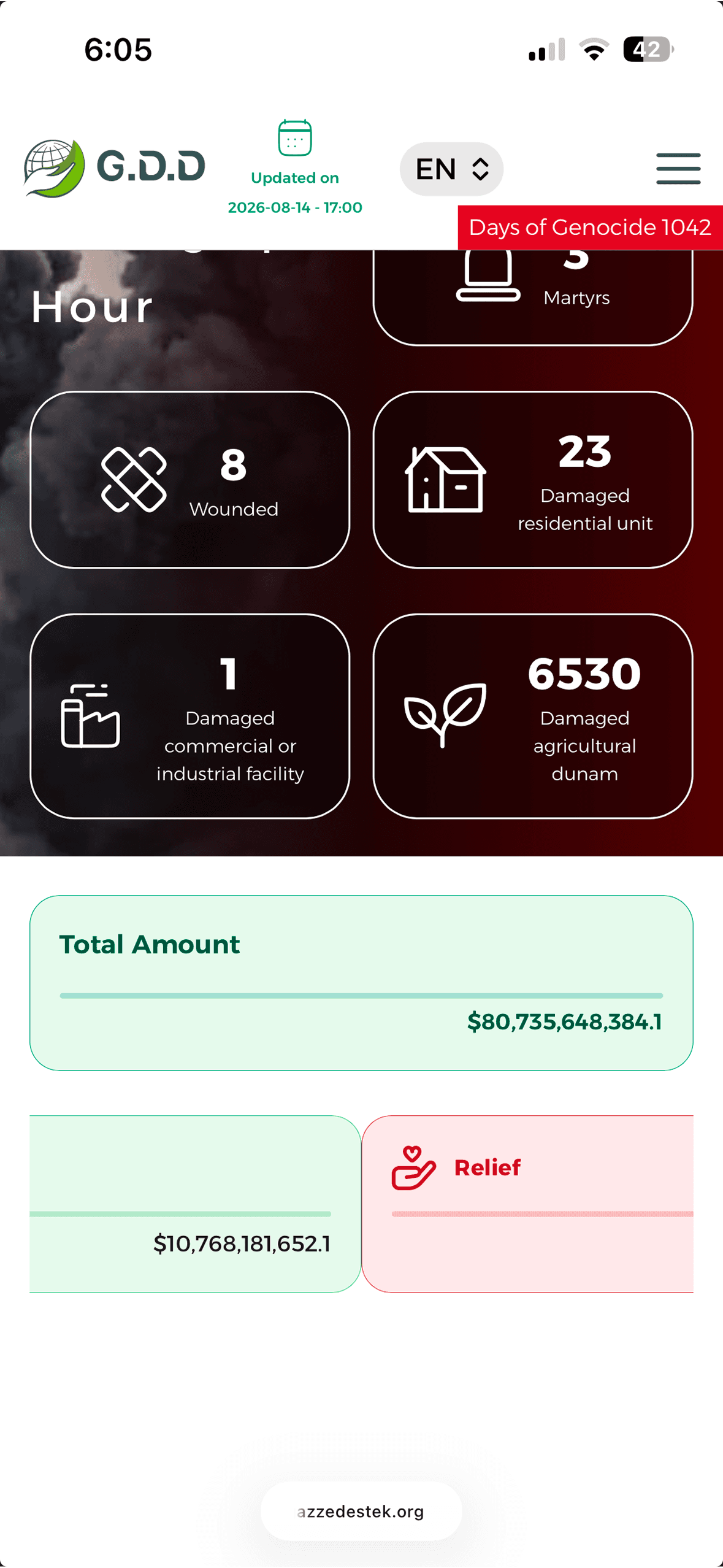
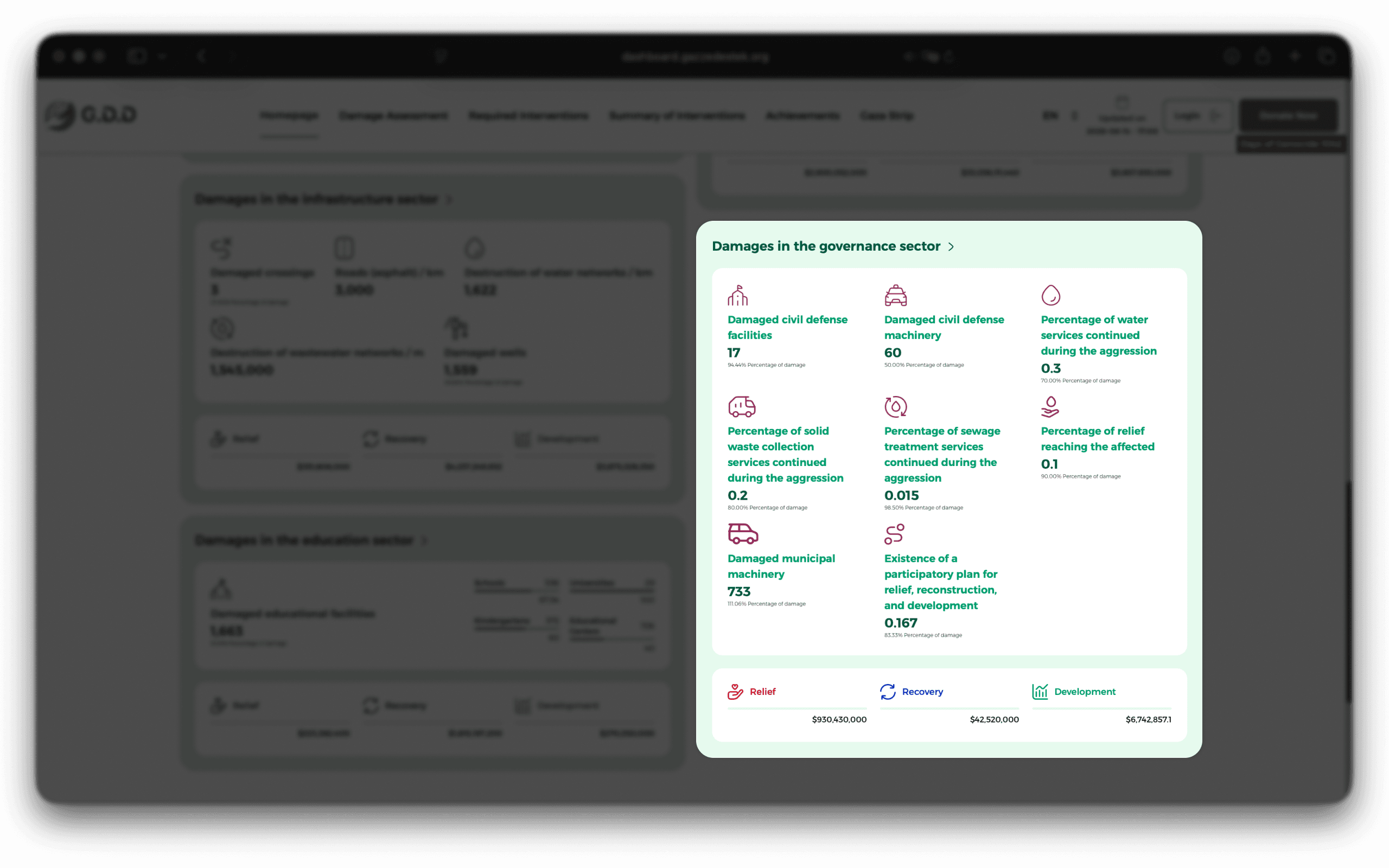
Three things carry it, and none of them is a chart.
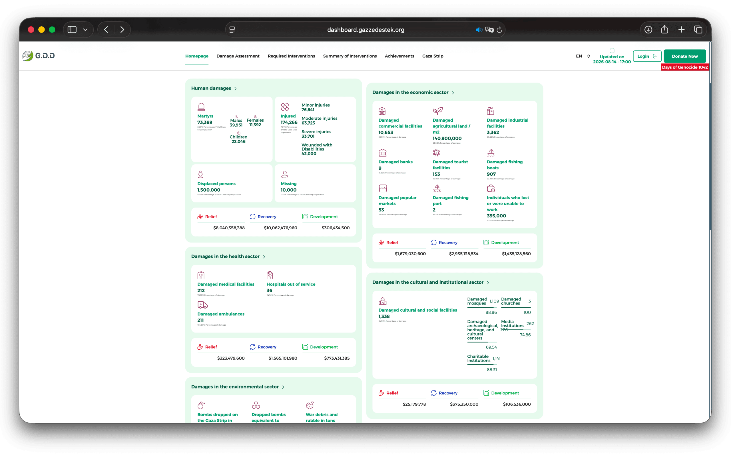
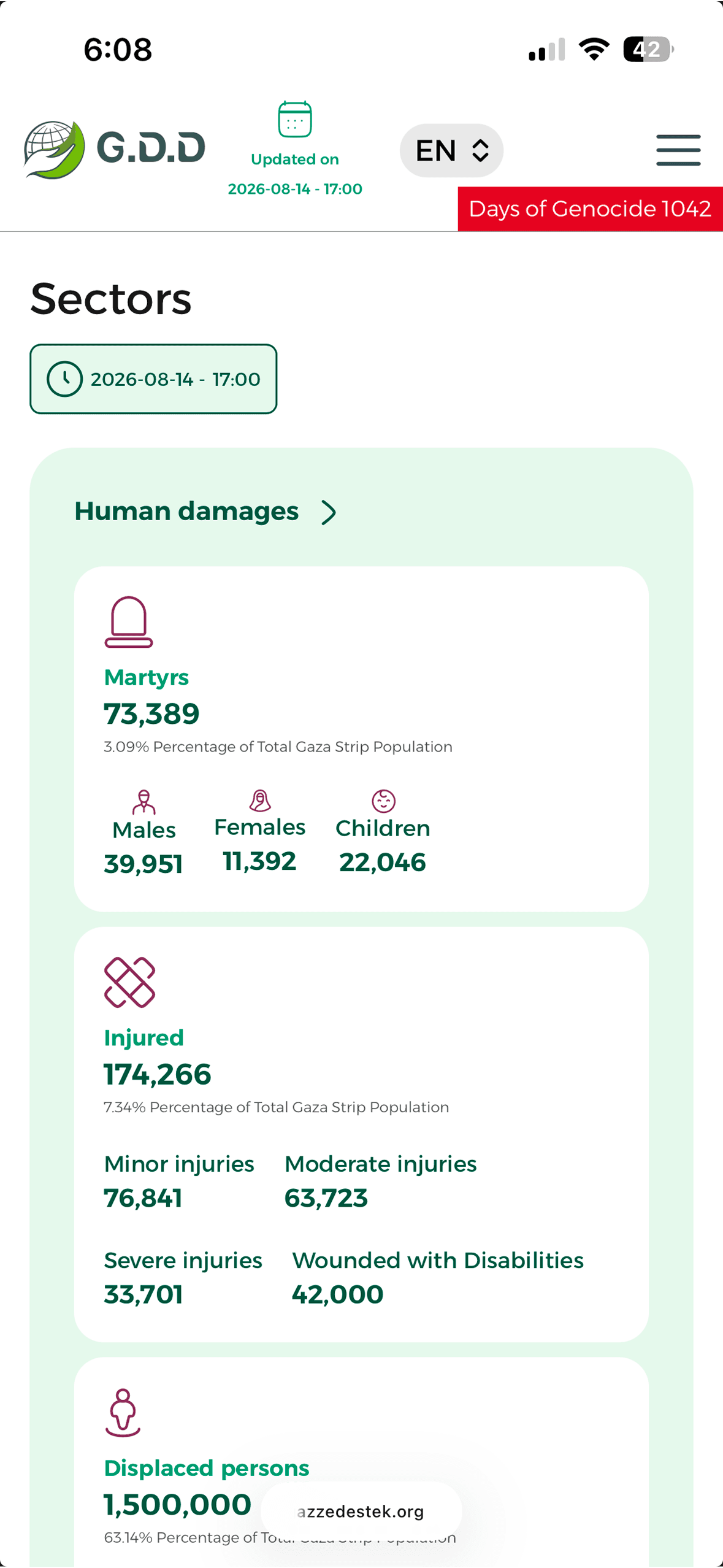
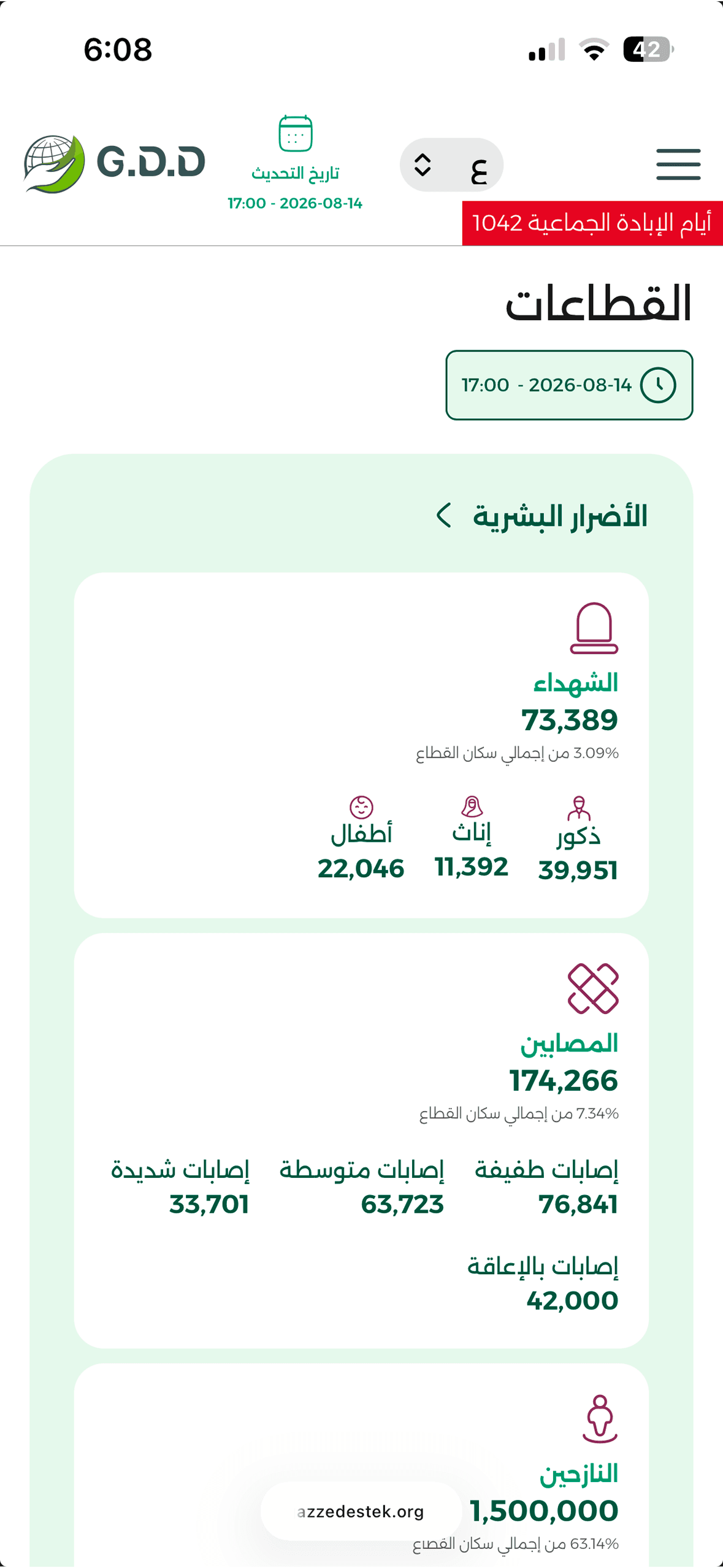
The type scale does the ranking. A figure is large, its label is small, and the percentage underneath is smaller still, so a sector reads in the right order before anyone has decided to read it. Get that wrong and every number on the page shouts at the same volume, which is the same as silence.
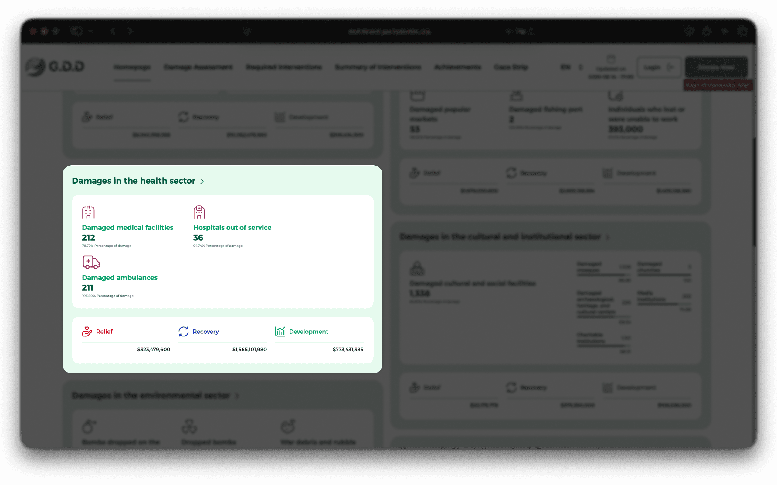
Icons do the scanning. Every metric has one, which is what makes the page findable rather than merely organised. You get to the hospitals by their shape, not by reading six labels to arrive at the seventh.
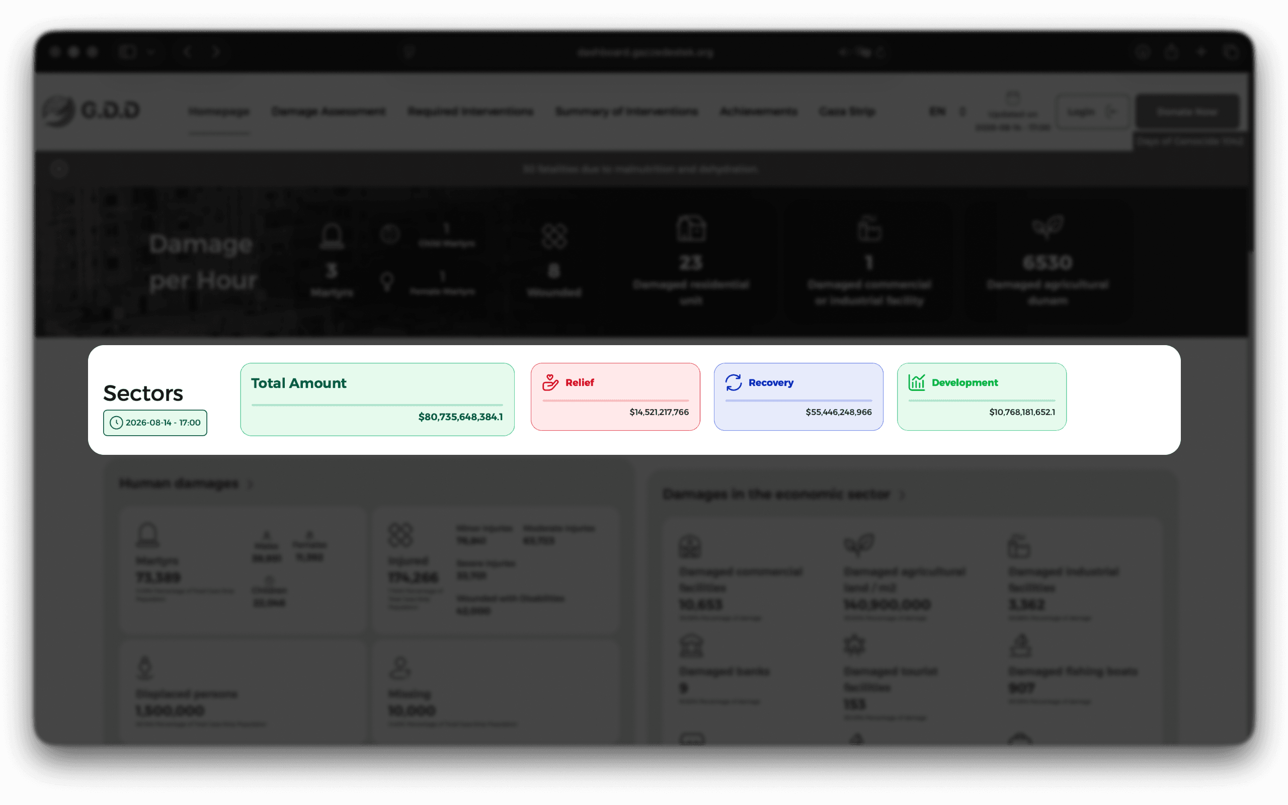
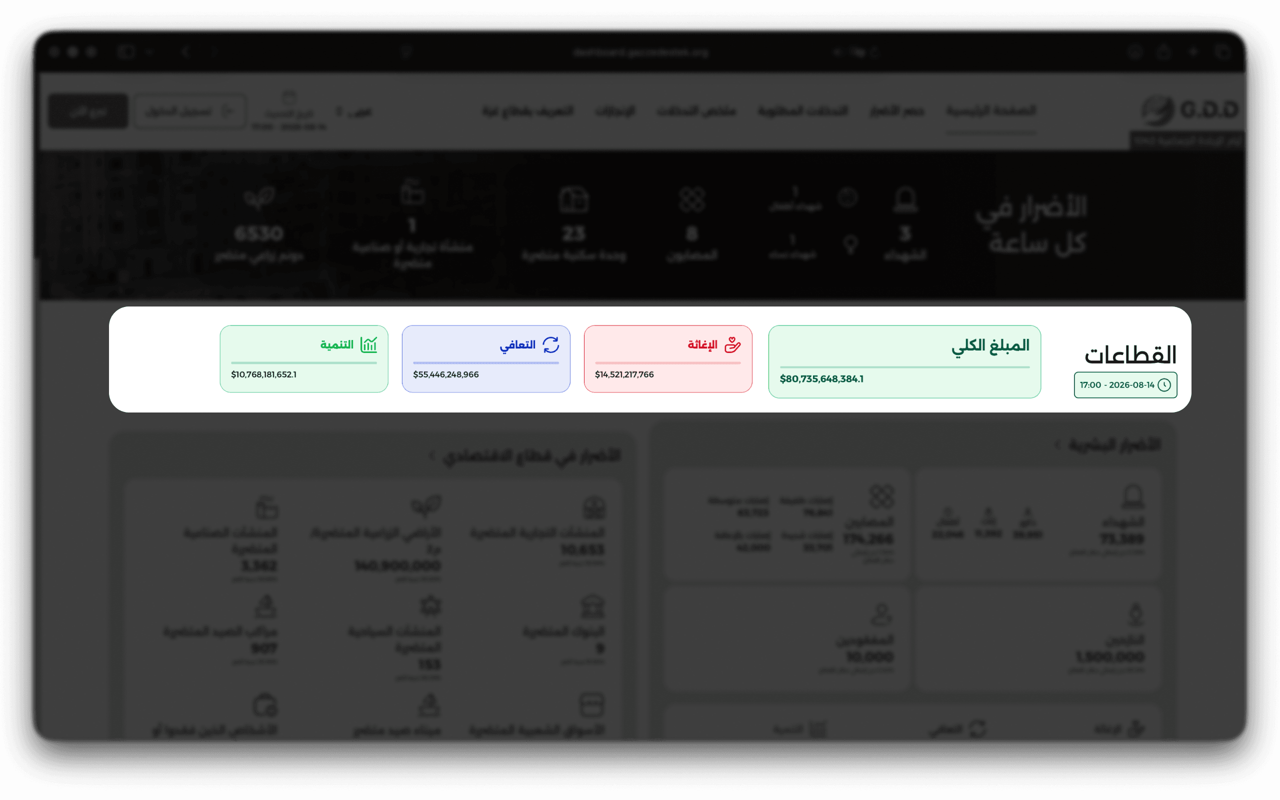
Repetition does the rest, and it is the part I would defend hardest. Relief, recovery and development appear at the top of the page as the site wide total, and then again under every single sector, as the same three cards in the same order in the same colours. You learn the pattern once, at the top, and after that you can read any of the nine without learning anything new. That is what lets the page be long without being tiring.